How do you design your country’s national font?
This is the story of the typeface you see above – ABCSans.
The ABC is Australia’s most trusted media brand. It is loved for its great content, which is available across multiple devices and platforms. So they set out to create a font family which unifies their digital presence across multiple platforms, while also being best-in-class for legibility and accessibility. It was designed to replace the thousands of font configurations in use across the ABC, allow for a proud, uniquely Australian typographical expression, and align with their charter to deliver content that contributes to our national identity. A single ABC font family would also reduce annual licensing costs associated with the numerous fonts previously used across the organisation.
But how do you design your country’s national font? I hoped to capture something of our national identity: encapsulate a sense of open space, a contrast that is simultaneously austere and rich, and a sense of inclusiveness. We also aimed for a tone of voice which was serious enough for news but light enough to suit a wide variety of human interest stories.
Firstly, let’s take a look at our national character
What defines us as a nation? In starting this project, I was required to think carefully about what sets us apart from other populations, both geographically and in terms of our identity.
When asked, most people might say things such as sun, thongs and beer. Also, the phrase “wide brown land” is familiar to every Australian — most of us see the outback as a unique identifier. But 85% of Australians live close to the coast, and every single Australian identifies with a beach lifestyle. So, coastal imagery is also a big part of our national identity.
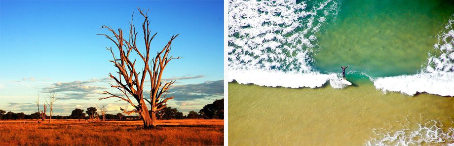
Looking at these images, it occurred to me that there is one factor which unifies all Australians: a sense of open space. Or what Tim Winton refers to as our “impossibly open sky, dwarfing everything” (and let’s face it, who could be better qualified to identify the national character than Tim Winton?). Winton also says “Australia remains a place with more land than people“ and that there is “an implicit collective understanding that the land is still present at the corner of our eye.” (Island Home) In my view, this applies equally to coastal landscapes as the outback, and I think we all feel a connection to land — and the open horizon which comes with it — whether its waves and sand, or red dirt.
There are of course other national characteristics, such as our proud diversity and our larrikin element (the little bit of ratbag in all of us). But for a font, a connection to land is the one I chose to focus upon.
Other fonts with national character
A few examples that I can think of are Johnston (the font of the London Transport Authority), Helvetica, and Sweden Sans (designed for the government of Sweden). Johnston and Helvetica were not designed to represent their countries’ identities, but rather have become iconic through their history and success, and therefore have come to be associated with England and Switzerland respectively.
The design process
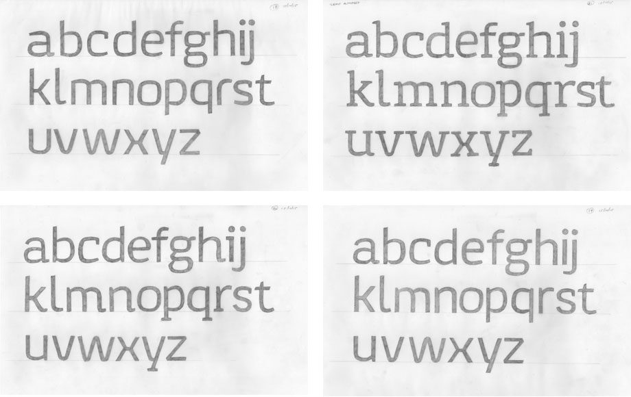
I always start with pencil on paper. It’s the quickest way to get ideas out, and also avoids me getting caught up in small details too early. I started with some vague scribbles, searching for some Australian signifiers within the basic letter shapes. I chose to document this entire project in a single sketchbook. Here’s a couple of the early pages:
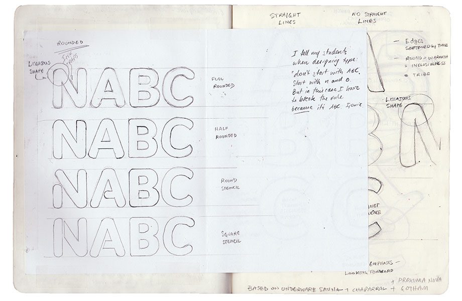
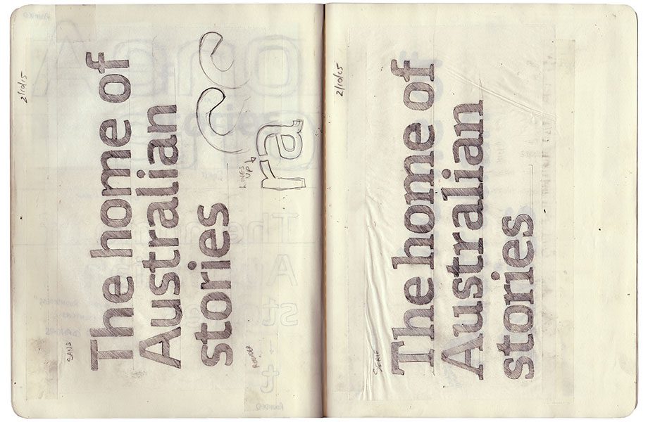
I showed some of these sketchbook roughs to the ABC Design Team, just to make sure I was in the ball-park. When I was confident in my concept, I produced some initial drawings covering sans serif, semi-serif and serif. I needed to know if the concept was versatile enough to work across the various forms. In the image below, you can see multiple layers of tracing paper. In the end, there were about 40 x A3 pages of alphabets just for the concept, before any vectors were produced.

Presenting the concept
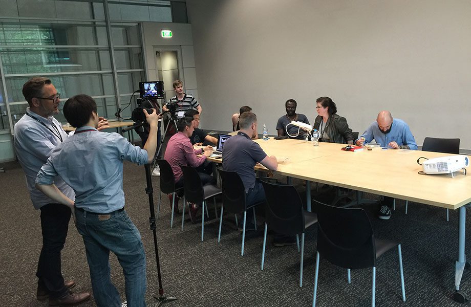
In a nerve-wracking meeting, I presented my ideas to a panel of about 8 people who represented both management and the design team, which was also recorded by a film crew “for possible use in a future documentary”. Thanks, I was hoping for some extra pressure. I created a 30-page PDF which explained the concept within the context of the ABC’s culture and design directions. It was the most nervous I’ve ever been. During this presentation I proposed a reverse italic (which leans left instead of right) on the grounds that it would have been “perfect for the ABC”. But they weren’t that way inclined. Obviously I didn’t really do this, but it would have been the best font joke ever.
Presenting the initial concept
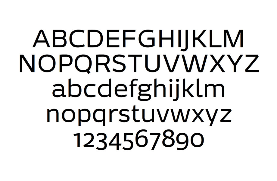
The next step was to produce the first set of vectored outlines. In the image below, which is the first ever alphabet of ABCSans, you can see the extreme wideness of the letters (the ‘wide brown land’ concept spoken about earlier), and you can also see several letter shapes which were ultimately dropped – the double decker g (which filled-in at small sizes), the stepped-join y and the rounded points on the A, V and W (a reference to the ABC worm). The design team found it too “Star Trek” – it was too wide (it would be uneconomical) and had futuristic touches which gave it a display rather than a text flavour.
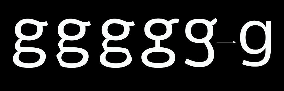
You’ll notice the double-decker g, which went through many versions (including some pretty weird ones) as we searched for a signature shape. Ultimately, all of them distracted from the reading process and — eventually—it was replaced with a single-decker g anyway for reasons of legibility.
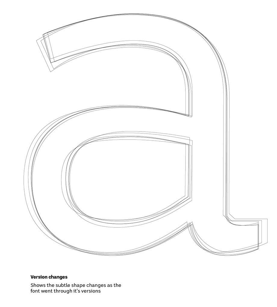
Most of the characters went through many subtle design variations, as shown in this graphic showing all the variations in lowercase a:
How do you embed national identity in a font?
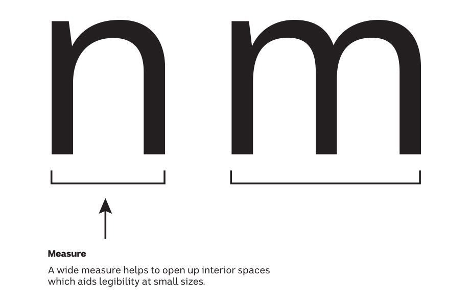
Initially, ABCSans was designed with a wider-than-usual measure, in an effort to subtly communicate the wide open spaces and connection to land. However, this had to be VERY subtle, because letter proportions are critical to legibility.
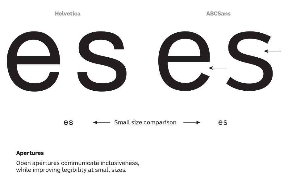
I tried to represent the national identity in ways which also improved legibility (since legibility is a primary requirement in any text face). As such, ABCSans includes deliberately open apertures — these avoid the letters ‘closing up’ at small sizes but also subtly communicate a welcoming, inclusive, easy-going nature.
Things that ultimately didn’t get included
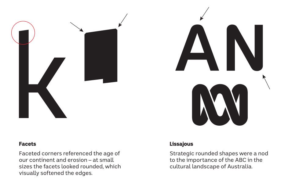
During the concept phase I explored all sorts of ways to incorporate national character, many of which didn’t make the final font. Here’s a couple of them. The facets (left) were intended to soften the sharp corners but they were too successful, and the font lacked sharpness on screens. The rounded shapes referencing the ABC ‘worm’ were also dropped because they made it more of a display font than a text typeface – and rounded corners would have compromised legibility.
A closer look at legibility
ABCSans’ target environment is screens, so it has been carefully crafted to maximise legibility. ABCSans also contains many accessibility features which are aimed improving legibility for people with reading disabilities such as dyslexia. Some of the features apply to the entire character set, while others relate to individual letter shapes.
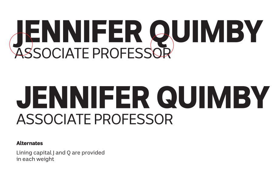
The J and Q dilemma
Capital J and Q both poke below the baseline to allow for more rhythmic spacing. However, this can create a problem when successive lines of text need to be close together, so alternate Lining versions of these characters were provided:
The final design
The full alphabet was eventually approved, and extensive screen testing was commissioned. A beta version was produced so the ABC developers could install it on their servers, and produce dozens of testing pages with real content for viewing across the widest possible variety of screens. I met with the team for an entire day in which we workshopped the beta by assessing a wall full of printouts, and comparing performance in text on devices. Adjustments were made to the beta on the spot, so the entire team was able to contribute to the final design. Based on the screen tests, some hard decisions had to be made; a few character shapes that I was wedded to (such as the rounded y and double decker g) had to go.
Completion of the character set
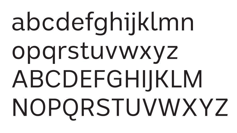
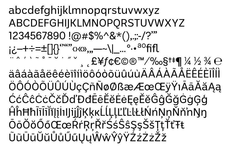
For anyone who would like to know how many characters are in this font, it’s a lot. This set covers all possible languages which use the latin alphabet:
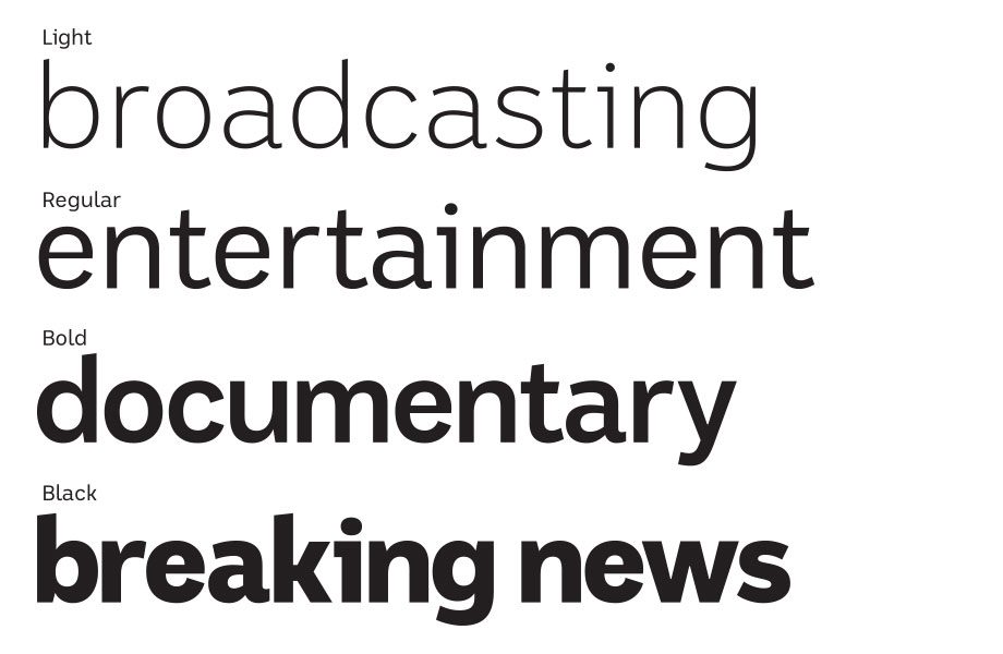
The other weights
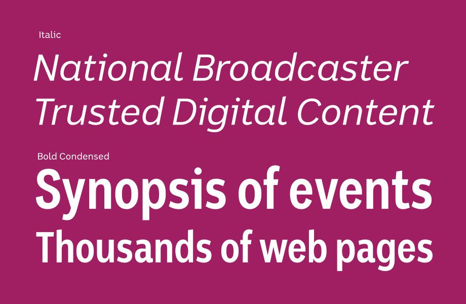
With some help from interpolation programs Prepolator and Superpolator, I was able to build the other weights Light, Bold and Black, as well as one-off Italic and Condensed weights:
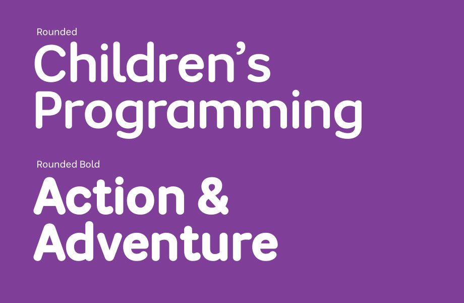
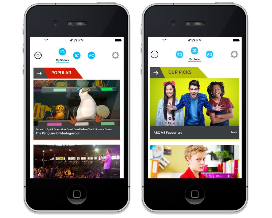
The ABC is a broad organisation, and they also needed some special-purpose fonts such as Rounded versions. These have been deployed in the re-brand of ABC Kids into ABC Me:
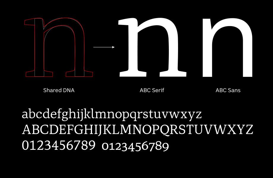
And finally, three serif weights were produced for text use. They share a common DNA with the sans with the intention that the two families will live side by side. The serif weights are designed for internal use only – so you won’t find these on the ABC’s broadcasting platforms.
The fonts in use
ABCSans has appeared on ABC television, the ABC website and on ABC mobile apps. In such a large organisation with multiple broadcast platforms, rollouts can take a long time. At the time of publication, some of the previous mixed typeface uses were still appearing, with the expectation that they will slowly be replaced by the new typeface suite as 2017 progresses. Here are some examples of the fonts in use:
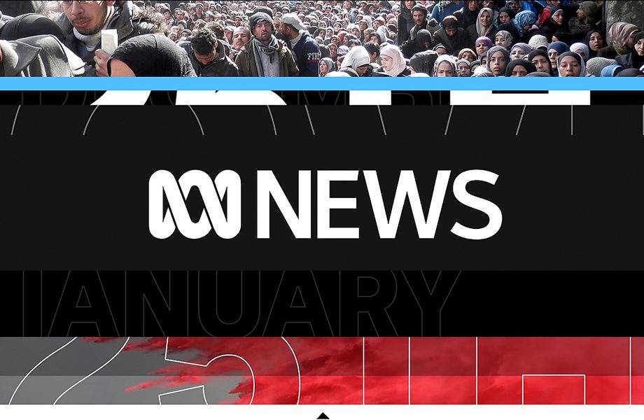
Image courtesy bdacreative.com
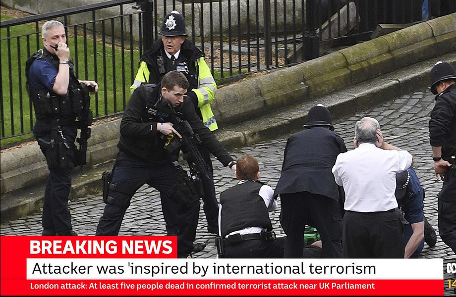
Image courtesy bdacreative.com

Image courtesy bdacreative.com
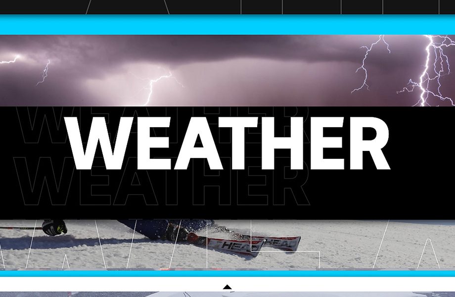
Image courtesy bdacreative.com
Here
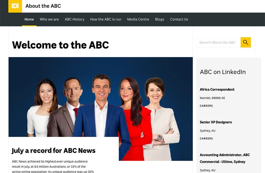
The new ABC font in use on ABC’s corporate website
Here is ABCSans Rounded in use in an ABC Comedy promo:
Stuff I Can’t Control
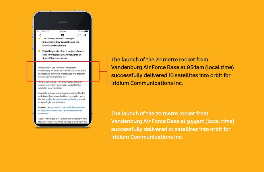
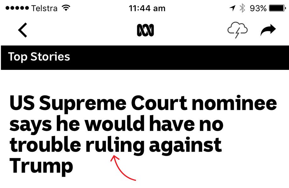
The ABC does not appear to be making use of the non-lining numerals built into the font. I don’t know why, when they would make in-text numbers a lot more palatable to the reader. This screenshot from the ABC Mobile App shows an example, and how the text would look if the numbers were substituted. They’re in there, why not use them?
I can’t control the way end-users deploy my typefaces. Sometimes choices are made which work against the font’s intentions, as in this example:
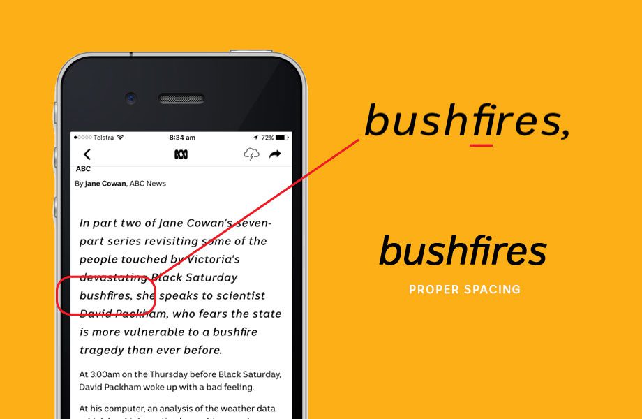
In this case, the end-user set italics with excess tracking (somewhat mysteriously) but the ligatures are hard-wired single glyphs, so they don’t widen. So you get spacing inconsistencies like in the word ‘bushfires’ above. The end-user probably have their reasons but, as the designer, this can be frustrating.
All I Can See Are the Flaws
Since ABCSans has been public, I have noticed one kerning pair in particular, and I can’t un-see it. It’s the l-i pair, seen in these screenshots from the mobile app:
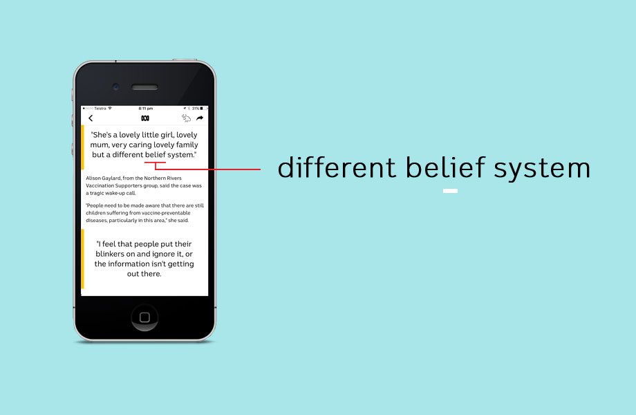
Two examples of difficult l-i spacing in ABCSans
How has ABCSans been received?
The reaction to the fonts has been overwhelmingly positive. The ABC is part of our fabric, and Australians display an affectionate sense of ownership towards it. But it also exists in a very sensitive political space. So it’s no surprise that there has been a small amount of poorly-informed commentary from sensationalist media based around ‘waste of taxpayer money’ etc and, due to a Freedom of Information request, the costs are now a matter of public record. My attitude is that public institutions should be accountable but not micro-managed. And those senators who questioned the spending are themselves paid by the taxpayer, so I hope they appreciate the irony. What the naysayers don’t know is that commissioning custom type often saves money, because you pay once rather than paying ongoing licensing fees for a large number of employees.
So, I hope this article will go some way towards righting some misconceptions, and help the ABC’s customers to understand just what it is they’re investing in.
In conclusion
What a privilege it’s been to work on this project! I will be forever grateful to the design team at ABC in Sydney for offering me this once-in-a-lifetime chance. Their experience, skill and commitment to the quality of the outcome was as good as anyone in the private sector. They welcomed me into their team and always respected my professional experience, without being shy when I needed guidance. It was a truly collaborative experience, and the success of the end-product is as much their doing as mine.