When I’m teaching lettering workshops, I like to bring my old sketchbooks along for students to thumb through. I don’t edit the books, they are warts and all. It shows students that we all make mistakes, and that not every piece is successful. I like to explode the myth that successful designers all have pristine sketchbooks, filled with page after page of perfect pieces. And sketchbooks are marvellous at revealing process. So, with that in mind, here are my top 7 tips for keeping a sketchbook:
1. Avoid blank-page syndrome.
I keep a list of inspirational phrases, funny words, names etc in the back of my sketchbook. Time to do sketching free-play is increasingly rare, so when it comes you won’t have to waste time thinking of something important to say.
2. Have something worthwhile to say.
I personally try to be more original than the common-place inspirational quotes such as “Do what you love”, even though they have their place. It’s different for everybody, but I try to inject a sense of humour into my work where possible.
3. Don’t be precious about your pages.
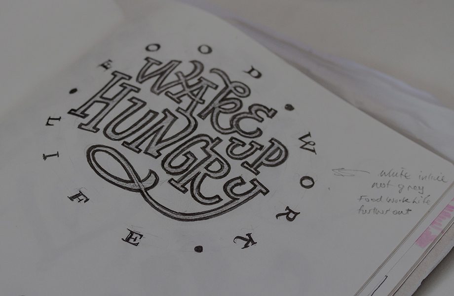
We all want perfect sketchbooks that people will go ‘oooh’ and ‘ahhh’ over. But you have to make messy mistakes somewhere. I use non-precious paper to practice, so I don’t feel bad about making mistakes. Scrawl over the top of newspaper, old magazines, or use butcher’s paper or the backs of laser prints. I once spent $7 on a reel-end from a local newspaper (the last 30m of newsprint that they don’t use on the big presses). I covered the entire 30 metres of paper in blackletter and brushpen practice, then recycled the lot.
4. Don’t be afraid to develop a style.
It’s easy to have letter-envy of other people’s work and not value your own style enough. I often look at my own stuff and hate it, but it takes a long time to learn that other people don’t see it the same way.
5. Be patient.
It takes a long time, a bloody long time. Just keep doing and doing and doing it. Frustration and impatience should be accepted as a normal part of the process. If you can play a musical instrument, you’ll understand this.
6. Find rhythm within your word.
The letter shapes themselves are actually LESS important than the space inside and around your letters. Reading is all about rhythm! The spaces should be consistent in size and if you can achieve spacing rhythm, you’re halfway there.
7. Don’t let people tell you to keep a tidy workstation.
Mine is a mess, and constantly in a state of flux as I move through projects. But I know where everything is, and that’s all that matters. It does annoy me sometimes, but not enough to want to tidy it up!
What are your top sketchbook tips?