- This event has passed.
Creating a Signature-style Wordmark
Do you design logos using type but don’t know how to customise them? Would you like to create vivacious typographic solutions for your design practice?
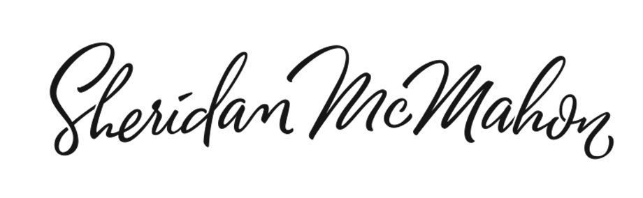
In this workshop, I’ll show you my technique for creating a typographic wordmark or logo. Using the example above, I’ll start with the drawing stages and demonstrate how I refine and improve the letter shapes, flow, and discuss the merits of ligatures, cursive joins and baseline consistency, as well as other lettering styles. I will also show you how to use tracing paper to improve your design in stages before photographing your wordmark and vectoring it using Adobe Illustrator, using the layers palette to record your iterations and compare versions.
The class will be structured around you creating your own wordmark, with time built-in for each participant to receive personal guidance. Your workshop fee also includes follow-up guidance for your wordmark in the weeks after the class.
Please bring your own laptop computer with Adobe Illustrator installed. If you don’t have access to a laptop, the drawing section of the class (roughly the first half) can be extended through refinement and practice to fill the class time.
WHO SHOULD ATTEND?
Design students and professionals who wish to improve their technique when creating logos, brands or headline typography; anyone wanting to improve their use of Illustrator’s pen tool.
DIRECTIONS:
The workshop will be in Building 7, Level C, Room 44 (labelled 7C44) on the university’s Bruce campus. It’s best to enter via Pantowora St and park in the Visitor carpark in front of Building 28 (the area marked blue ‘P28’ in this parking map). Note that parking areas not marked blue are permit-only. After parking, enter Building 7 and take the stairs or lift up to level C, exit lift/stairs and turn left, go to the end of the corridor where there is a mural that says “Graphic Design” and enter the double glass doors right ahead.
WORKSHOP PROGRAM
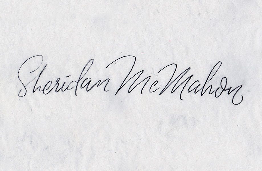
Here’s a more detailed outline of the process we will follow in class: First, you will spend time creating quick sketches of your own word mark before choosing one for further development. Here’s my first sketch: note that it’s monoline, with no thicks or thins yet.
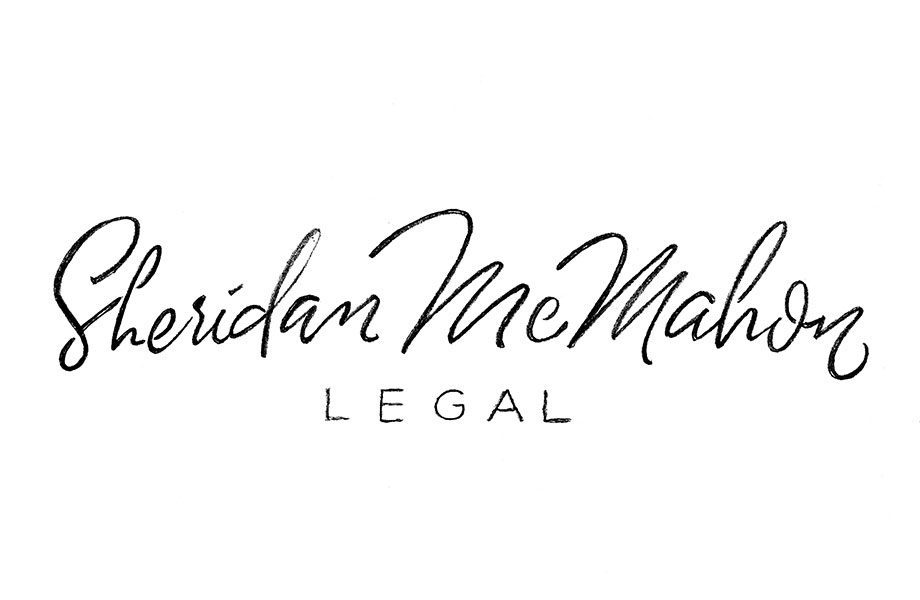
The next stage is to refine the drawing using tracing paper. This is so we can adjust letter spacing, modify size relationships and make sure we have the cleanest original possible for importing into Illustrator:
Then we start vectoring. Here’s a screenshot showing the process. I’ll show you how to keep your curves smooth and make sure your logo has zing.
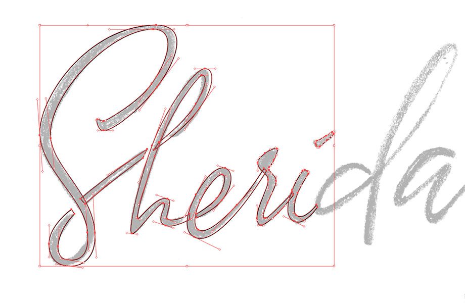
Notice how the letters are all separate shapes? This allows you to adjust spacing and size relationships, and even rotate letters if you want. By the end of the class, you should have the skills to finish it off – your own professional logo!